Navigate treatment planning
You can review a lot of information from the treatment planning panel. This article describes how it is grouped and what different icons mean.
If the amount of information becomes overwhelming, there are a few options to simplify what you're looking at.
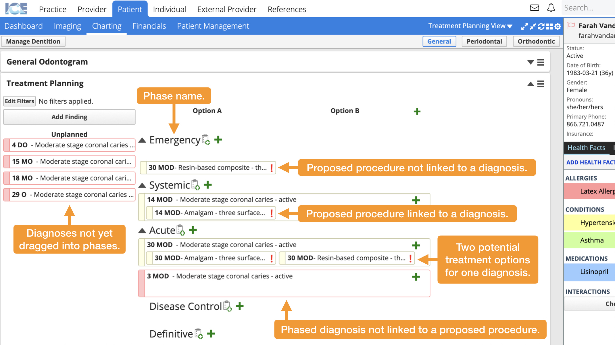
How is information organized in treatment planning?
Diagnoses that haven't been placed in a phase are displayed on the left. Treatment options are displayed in one or more columns to the right.
Treatment options can be grouped into phases to help organize the treatments. Each phase can be collapsed or expanded to help simplify your display.

Diagnoses that have been placed into phases stretch across all treatment options. Procedures are less wide and only appear in one treatment option column.
If a procedure and diagnoses have been linked, the procedure appears inside of the diagnosis. You can associate multiple procedures to the same diagnoses.
What do the different icons mean?
Each procedure you add to the treatment plan may need to meet certain requirements defined in Practice Settings.
- If the procedure has met all of its requirements you see a
- If the procedure has unmet requirements you see a
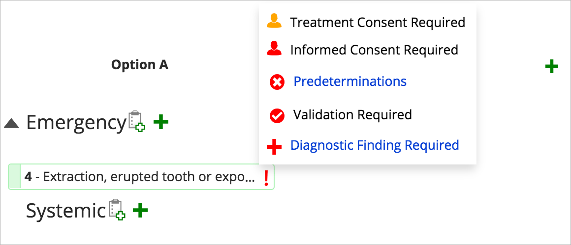
Clicking the icons shows you a requirements popover with details about what that procedure needs.
- This procedure has unmet requirements.

- This procedure has met all of the requirements.

Here is a summary of the requirements that can appear in the popover.
| Icon | What it means | How to resolve it | What it becomes |
|---|---|---|---|
| This procedure requires a treatment consent. | Select | ||
| This procedure requires an informed consent. | Select | ||
| This procedure requires an insurance predetermination. | Create a Predetermination Claim in Patient > Financials that is approved by insurance. To learn more, see Predeterminations overview. | ||
| This procedure requires validation. | Request that a supervisor validates your work. To learn more about validation, see Validation overview. | The | |
| This procedure must be linked to a finding. | Select | The | |
| This procedure is connected to an appointment | Nothing to resolve. Select to view appointment details. | - |
If your consent forms require validation by a supervisor, the and
do not turn green until the consent forms are validated.
How do I simplify what is displayed?
If you have a lot of information in the treatment planning panel you can:
- Expand/Collapse phases by selecting
to the left of a phase's name.
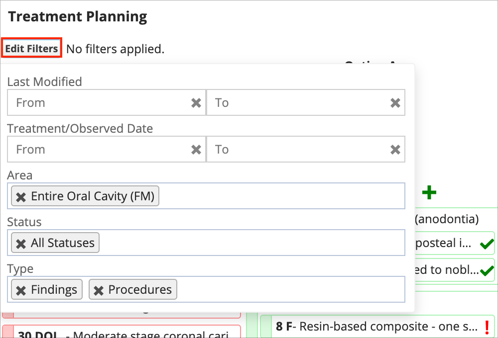
- Filter by selecting Edit Filters and entering different variables.
- For example, you can filter to only show In-Progress Procedures, or only show findings and procedures related to a specific tooth, or hide all procedures and only show findings.

- For example, you can filter to only show In-Progress Procedures, or only show findings and procedures related to a specific tooth, or hide all procedures and only show findings.
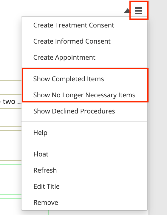
- Use the
to show or hide Completed or No Longer Necessary procedures.
- These appear in their own special section at the bottom of the treatment plan.

- These appear in their own special section at the bottom of the treatment plan.